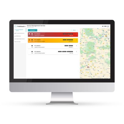
Time Series Data Service dashboard on a monitor

Time Series Data Service: All process data available centrally

The Time Series Data Service enables tailor-made digital visualizations and the analysis of data in individual dashboards. Limit value violations can be flexibly configured, whereby notifications are sent to the responsible persons. With its adaptability, this Smart Service provides support for a wide range of application areas and industries, enabling efficient and reliable data-based decision-making.

Ask a question for additional information about these products

Advantages of the Smart Service: Times Series Data Service

  • Retrieval of process data from anywhere, at any time via a scalable cloud service
  • Fast and precise visualization of all relevant parameters, such as the rotation speeds of a wind turbine, motor temperatures, flow rates, or even reject rates
  • Universal use and flexible functions with easily configurable, web-based dashboards
  • Use of individual, configurable dashboards or ready-made dashboards via the TSD Dashboard Library

Comprehensive data transparency with individual dashboards


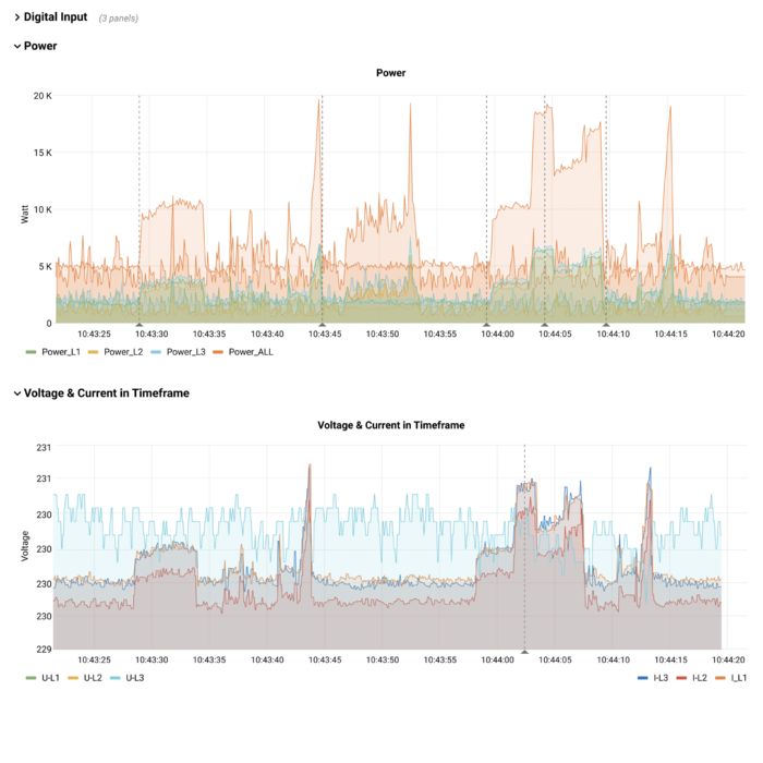
Time series data displayed in the Graph widget

Flexible Graph widget for visualizing time series data

The Graph widget is one of the most popular and flexible options for displaying time series data. It can be customized for different applications and enables user-friendly visualization.

The customization options are varied: Whether color, fill, labels, or units – the Graph widget can be adapted precisely to the respective requirements.

Another highlight is the ability to create alerts directly via the widget. This means that users can be notified automatically if defined limit values are exceeded, which ensures a fast response to critical events.

Pie chart in the Time Series Data Service

Intuitive Pie Chart widget for visualizing data ratios

The Pie Chart widget enables the simple and intuitive representation of ratios in order to show distributions at a glance. It is ideal for visually highlighting correlations and proportions.

The widget offers the flexibility to display both total and percentage values. The visualization can be customized to the needs of users – from colors and labels to units and other display elements.

With its customizable features, the Pie Chart widget helps users communicate complex data in a clear and understandable way.

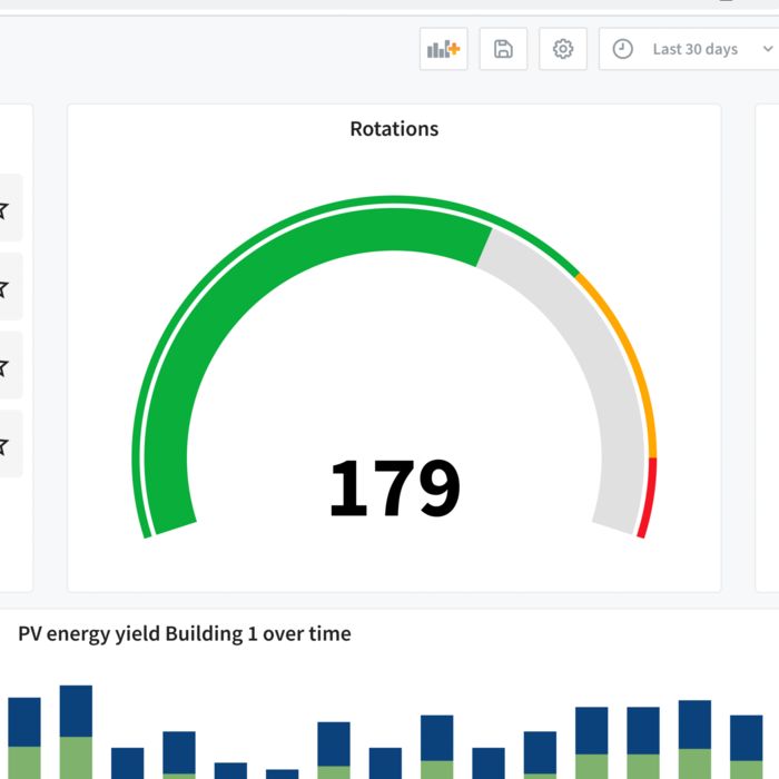
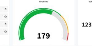
Gauge widget with defined limit values

Clear status detection with the Gauge widget

The Gauge widget provides an effective way of displaying data so that users can see the current status at a glance. The visualization is based on defined acceptance ranges, e.g., in the form of color zones such as green for “OK”, yellow for “Warning”, and red for “Critical”.

A special feature of the widget is the flexibility when defining limit values: Any number of threshold values can be defined and clearly displayed in the widget. With this intuitive display, the Gauge widget helps users interpret data quickly and respond to critical developments in good time.

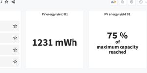
Plain text messages and color coding of data with the Stat widget

Plain text messages and color coding of data with the Stat widget

The Stat widget provides the option to display individual data, such as the last, highest, lowest, or average value. This allows important key figures to be visualized in a targeted and clear manner.

A particular highlight is the function for setting up color coding to facilitate fast status evaluation. For example, displaying values up to 80 in green, values above 80 in yellow, and values above 100 in red.

Furthermore, the widget allows the configuration of plain text messages that can be generated automatically based on the data. This function makes it possible to link numerical values with meaningful messages, such as: “Everything is running normally” (up to 80), “Machine is running hot” (above 80), or “Machine is being switched off” (above 100).

By combining color coding and plain text, the Stat widget helps users to interpret complex data intuitively and take immediate action.

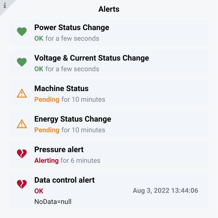
Overview of alerts with the Alert List widget

Overview and management of alerts with the Alert List widget

The Alert List widget provides a central overview of all alerts set up. This means that users can efficiently view the current status of the monitored data or display status changes within a defined period of time.

The display can be flexibly adapted: The user decides whether only alerts with a specific tag or from a specific dashboard should be displayed. This makes it easier to focus on relevant information.

A particularly practical feature is the direct link to the widget in which the relevant alert was created. With just a click, the user can obtain detailed information without having to perform a lengthy search for the source.

The Alert List widget combines clarity with efficiency and ensures that users are always in control of their alerts.

Stat widget: Many possible applications Maximum flexibility for your data monitoring and visualization

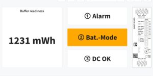
Stat widget with plain text messages
MWh in Stat widget
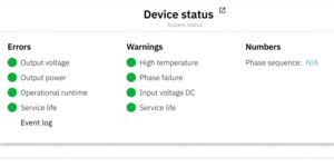
Device Status in the Stat widget
Battery Flow Chart Diagram
Stats with value replacement

Wide range of application examples for the Time Series Data Service Cross-sector application possibilities in detail

Time Series Data Service dashboard for utility metering
Dashboard for Power Reliability hardware
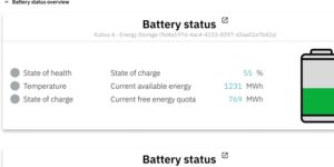
Dashboard for battery energy storage systems
Time Series Data Service dashboard for utility metering

The Time Series Data Service provides a comprehensive solution for utility metering by collecting, monitoring, and analyzing energy data. This data includes various forms of energy such as electricity, gas, water, and heat.

Using individually configurable dashboards, users can monitor important parameters to optimize energy consumption and identify problems at an early stage. This helps companies reduce energy costs and make power distribution more efficient. In addition, the precise acquisition and analysis of energy data also enables compliance with official regulations and means that corresponding reports can be created.

Find out more at Proficloud.io

Dashboard for Power Reliability hardware

Combining the Time Series Data Service with system availability solutions from Phoenix Contact offers numerous advantages for reliable power supply and efficient operating processes.

By continuously monitoring the power supply and the subsystems, potential problems can be detected and rectified at an early stage, thus increasing system availability in the long term. The available data makes it possible to carry out maintenance work specifically based on the actual operating conditions. This reduces unplanned downtimes and extends the service life of the devices used.

All relevant parameters are recorded and visualized centrally, ensuring a comprehensive overview and traceability. In addition, the Time Series Data Service can automatically trigger alerts if limit values are exceeded, enabling immediate measures to be taken.

Through this powerful synergy, companies will not only ensure the reliability of their power supply, but also optimize their operating processes and reduce costs.

Find out more at Proficloud.io

Dashboard for battery energy storage systems

Powerful hardware and Smart Services are combined to provide a ready-to-use, scalable solution for the use of battery energy storage systems. This combination quickly and efficiently maximizes the benefits of energy storage systems.

The dashboards provide comprehensive insights into key health parameters, such as charging cycles, temperatures, and the general condition of the energy storage systems. In addition, detailed metrics regarding charge data, including the charge level, maximum charge, and capacities available for charging, are provided.

In the field of renewable energy, where electricity cannot always be fully fed into the grid, battery storage systems are crucial. Surplus energy can be stored temporarily and fed in at a later point in time to ensure grid stability. For maximum efficiency, a clear overview of energy generation and the storage status is required.

This overview is provided at the touch of a button – without the hassle of having to develop your own dashboards. Efficiency is increased and control over the energy systems is maintained at all times.

If the dashboards need to be extended and adapted with email notifications or other metrics, they can be saved in their own folders and the ready-made dashboards can be further optimized.

Find out more at Proficloud.io
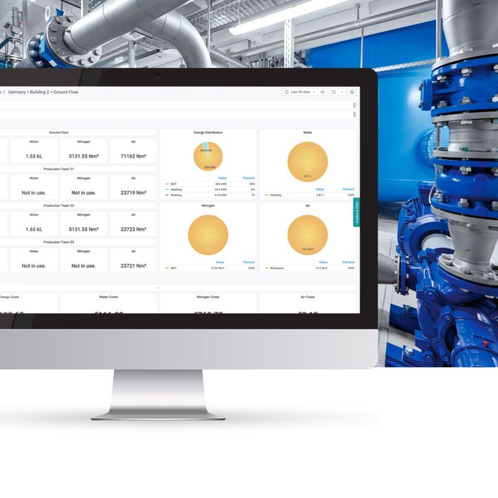
Dashboard for wind power
Time Series Data Service dashboard for a production example
Monitoring of solar power
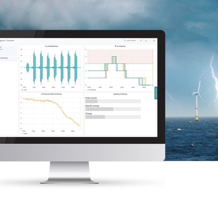
Dashboard for wind power

Monitoring wind turbine generators offers a wide range of advantages – from optimized operating time to improved planning of maintenance windows.

With the Time Series Data Service and the customizable dashboards, combined with reliable hardware from Phoenix Contact, wind farm operators can operate their systems more efficiently. For example, measuring icing on rotor blades prevents wind turbines from being shut down as a precautionary measure. If the measured value exceeds a defined threshold value, an automatic notification is sent and the system can be stopped to avoid damage.

In addition, monitoring the structural health of wind turbine generators enables more precise planning of maintenance windows. Another highlight of the Phoenix Contact solution is the measurement of lightning strikes, which enables damage to be detected at an early stage and measures to be taken more quickly.
With this comprehensive solution, Phoenix Contact supports wind farm operators in increasing operational efficiency while ensuring safety.

Find out more at Proficloud.io

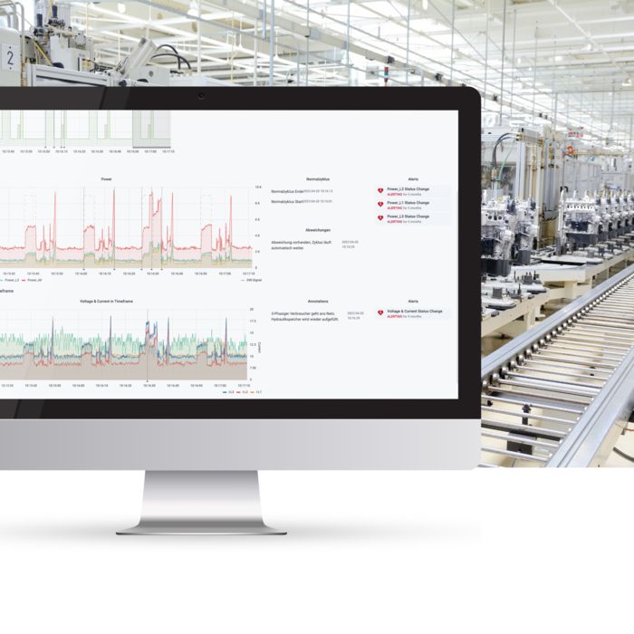
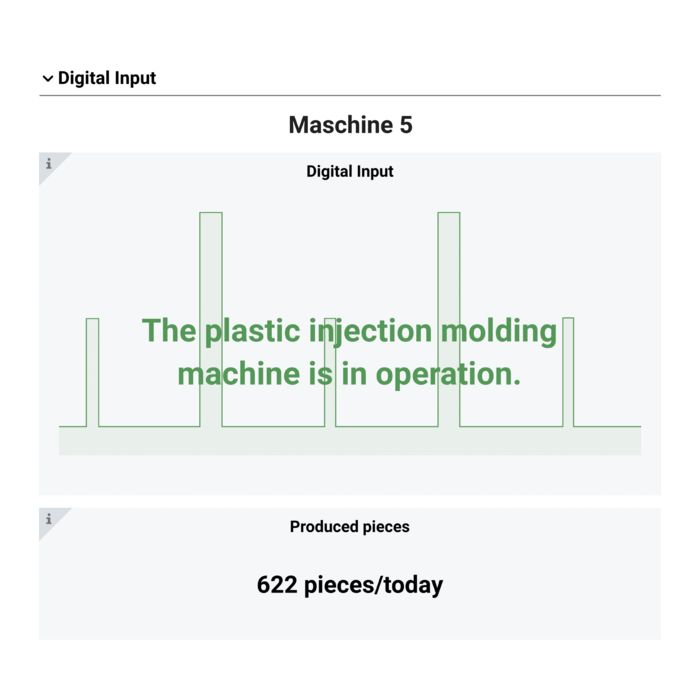
Time Series Data Service dashboard for a production example

In the Time Series Data Service, manual workflows are reduced by using proactive measures based on automatic notifications. Monitoring motor temperatures, flow rates, or reject rates makes it possible to make maintenance tasks predictable in production, saving both time and money.

In production, the continuous monitoring of these parameters increases the efficiency and reliability of machines and systems. By analyzing temperature, flow, and reject data, potential problems can be identified and resolved at an early stage before they lead to costly failures. This enables optimum planning and execution of maintenance work, whereby production processes run more smoothly and system availability is increased.

Find out more at Proficloud.io
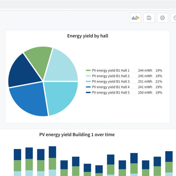
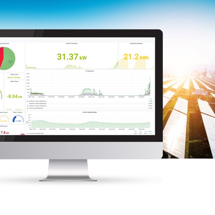
Monitoring of solar power

Having a clear insight into data from solar parks is crucial when it comes to promoting efficiency and sustainability in industrial solar power. The Time Series Data Service provides a comprehensive solution for monitoring and analyzing all relevant operating data. This enables solar park operators to acquire, store, and visualize time series data in order to continuously optimize the performance of their systems.

The flexible visualization options enable individual dashboards to be created, which provide a clear overview of important key figures such as energy yield, sunlight, and panel temperatures. The limit value monitoring function reliably detects deviations and informs the relevant stakeholders. This enables problems to be identified and rectified at an early stage, which helps to minimize downtimes and increase efficiency.

Find out more at Proficloud.io
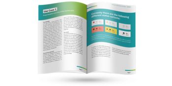
5 use cases:
Smart services in practice

Find out how companies use our cloud services across industries to quickly and easily boost the efficiency of their daily work routines.

Discover the Smart Services
White paper on the Smart Services

TSD Dashboard Library Visualize data in seconds

The TSD Dashboard Library offers a selection of ready-made dashboards based on proven Phoenix Contact hardware, such as devices from the Power Reliability range, or developed for hardware-independent use cases such as battery energy storage systems.

These dashboards are scalable and prepared in such a way that they just need to be supplied with data in order to provide key insights in just a few steps. This saves you time and allows you to get monitoring and analysis started straight away.

The dashboards can be flexibly customized to suit individual requirements. For example, you can add a notification system to respond to critical events or consolidate multiple dashboards to gain a more comprehensive overview – tailored to your needs.

Another advantage is that the TSD Dashboard Library is being continuously developed and extended, so it is worth checking out regularly and benefiting from new functions and use cases.
Use the TSD Dashboard Library to get up and running straight away – without having to start from scratch.

Out-of-the-box monitoring for Phoenix Contact hardware and device-independent use cases

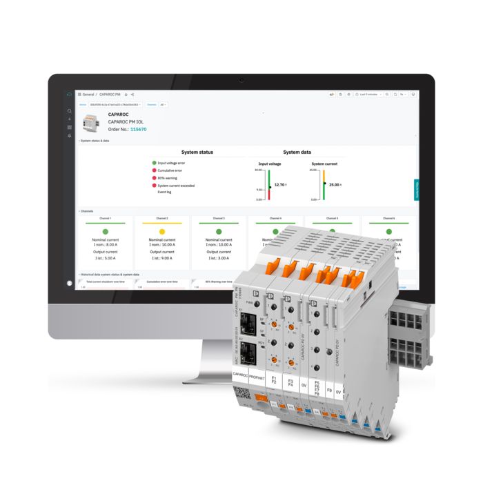
Dashboard from the TSD Dashboard Library with CAPAROC hardware
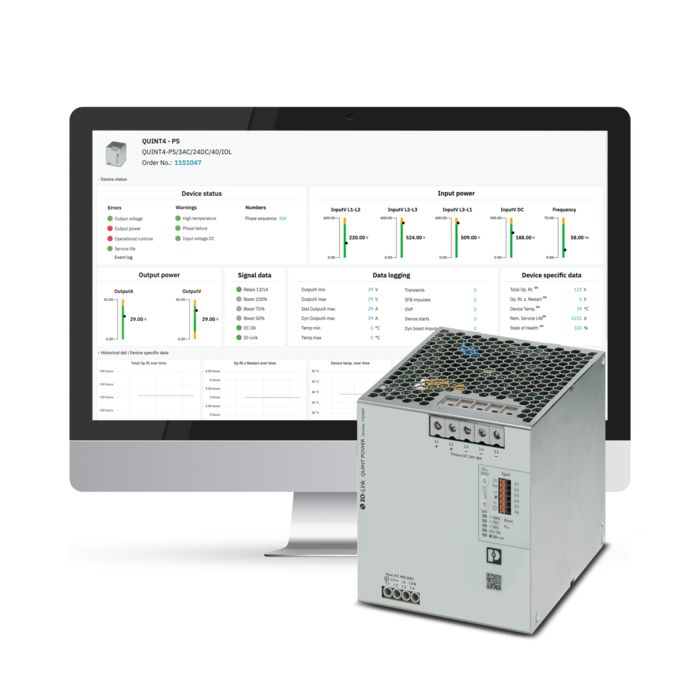
TSD Dashboard Library with the QUINT4
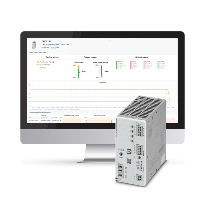
TSD Dashboard Library with the TRIO3
TSD Dashboard Library with EMpro
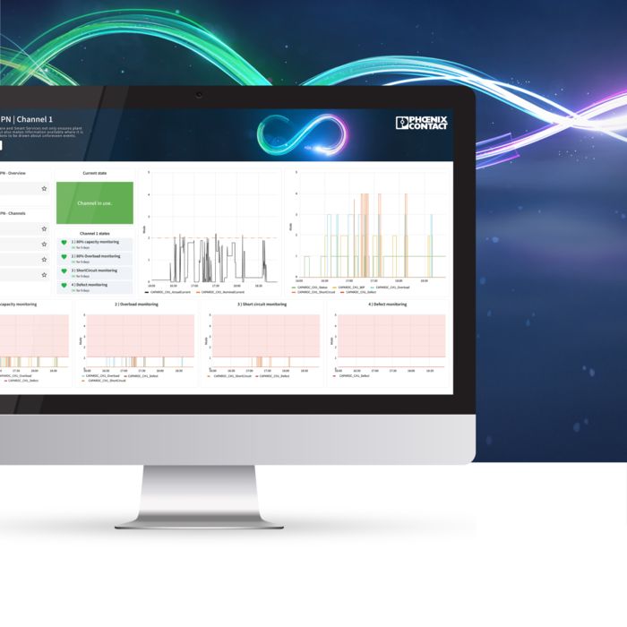
Dashboard from the TSD Dashboard Library with CAPAROC hardware

Monitor smart hardware from Phoenix Contact or use the TSD Dashboard Library for device-independent use cases – easily and effectively. The continuous connection provides you with direct access to historical data so that you can analyze trends and detect sudden changes at an early stage.
The dashboards help you fully exploit the performance capabilities of your hardware while providing important insights into common use cases. They not only provide support when planning measures such as replacement procurement, but also ensure that you receive relevant information at all times – and all of this with minimal effort.
Use the TSD Dashboard Library to efficiently monitor your systems and make decisions based on data.

TSD Dashboard Library with the QUINT4

The dashboards in the TSD Dashboard Library are already fully preconfigured and ready to use. They just need to be filled with data to provide valuable insights straight away. Save time and get started without time-consuming preparatory work – the dashboards are ready to efficiently visualize and analyze data.

TSD Dashboard Library with the TRIO3

For more extensive use cases, the dashboards in the TSD Dashboard Library can be customized at any time. Notification systems can also be adapted and created with just a few clicks.

TSD Dashboard Library with EMpro

What works for one device also works for 10, 100, or even 1,000. The dashboards in the TSD Dashboard Library are designed so that they can automatically detect incoming data and display it in a flexible and scalable way.

Whether monitoring a small application or a large network, the dashboards adapt seamlessly to the requirements and provide precise insights – regardless of the amount of data involved.

Find out more

For further information, to book a demo, or to register for the Time Series Data Service, visit Proficloud.io: