

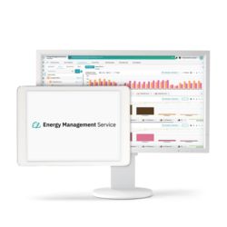


Time periods can be defined individually. In addition, two data streams can be compared in a common diagram. Advanced visualization tools such as heatmap, streamline, Sankey, and Pareto diagrams enable in-depth analyses and new perspectives on consumption and efficiency data.


